Funder Safeguarding Collaborative - Brand identity
A brand identity for the only philanthropic support organisation dedicated to safeguarding, helping funders keep the communities they support safe.
CLIENT
Funder Safeguarding Collaborative, UK
AGENCY
—
ROLE
Brand identity
DELIVERABLES
Logo, colour palette, typography, stationery
TOOLS
Illustrator
The brief
FSC was founded in 2021 by Comic Relief, Global Fund for Children, The National Lottery Community Fund, Oak Foundation and Porticus. Today it brings together more than 120 funders, with a combined annual grant-making budget of over $9 billion, to prevent abuse and exploitation in the organisations they fund. The identity had to speak to large funders with authority, while keeping a difficult subject approachable.
The idea
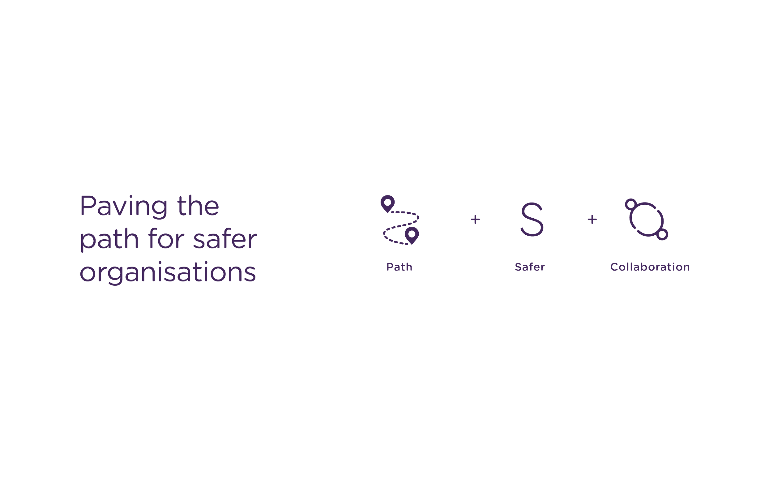
The concept grew from one line, “paving the path for safer organisations”, and three ideas: path, safer and collaboration. The symbol is made of open arcs that read as a path and come together into one protective circle. It only works as a whole.
The system
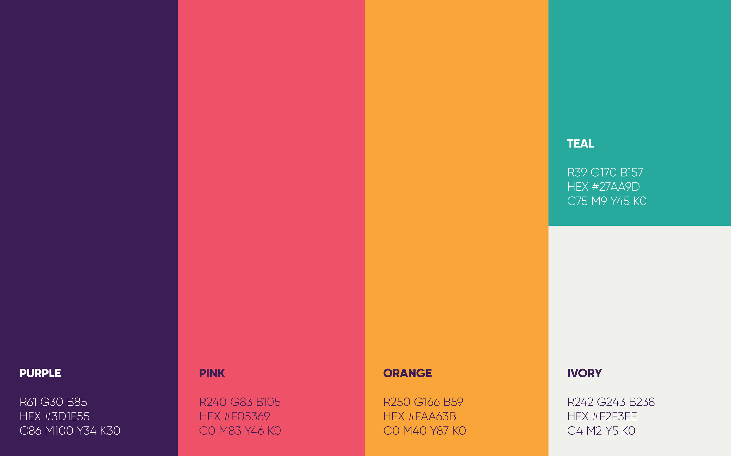
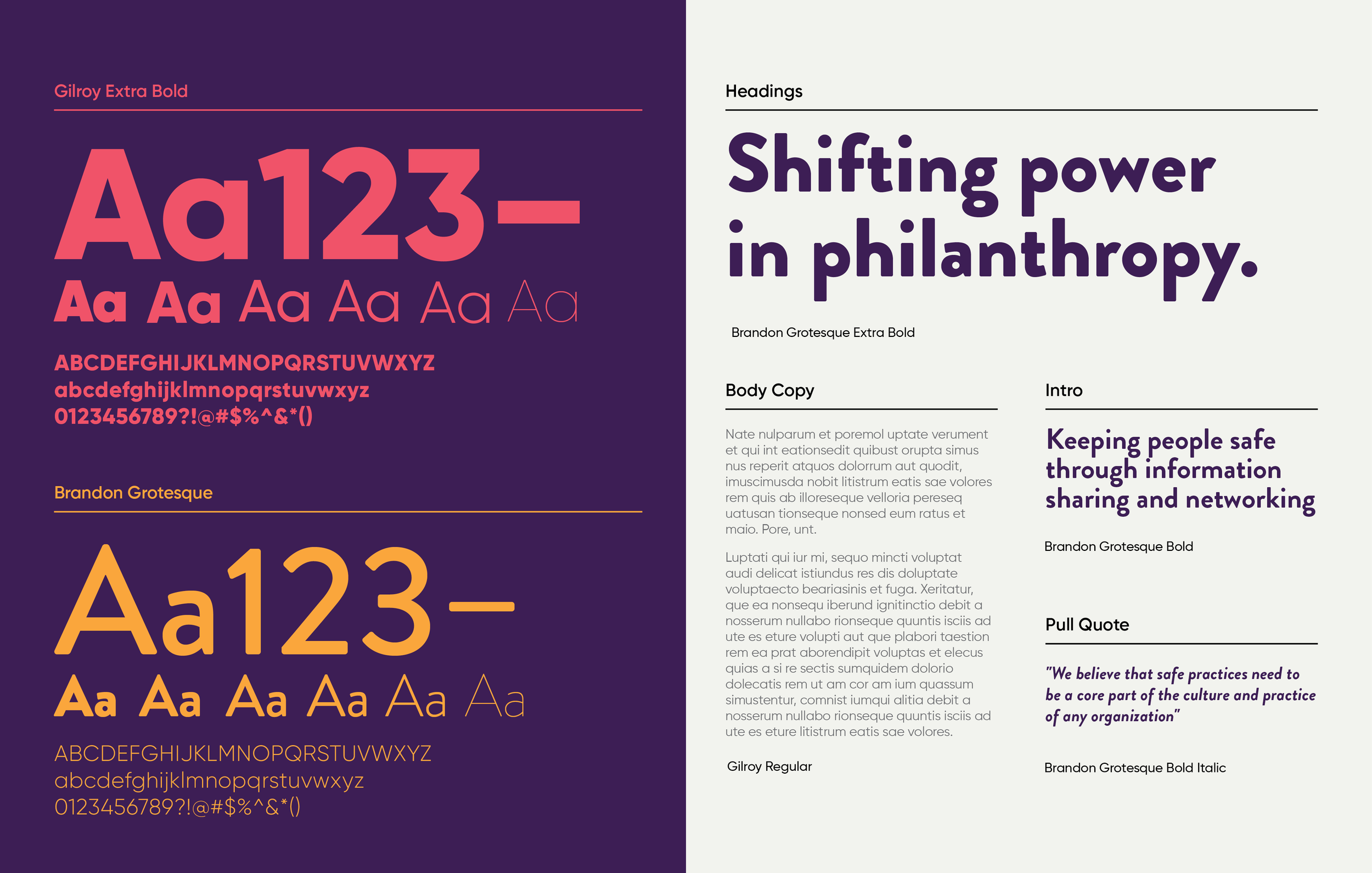
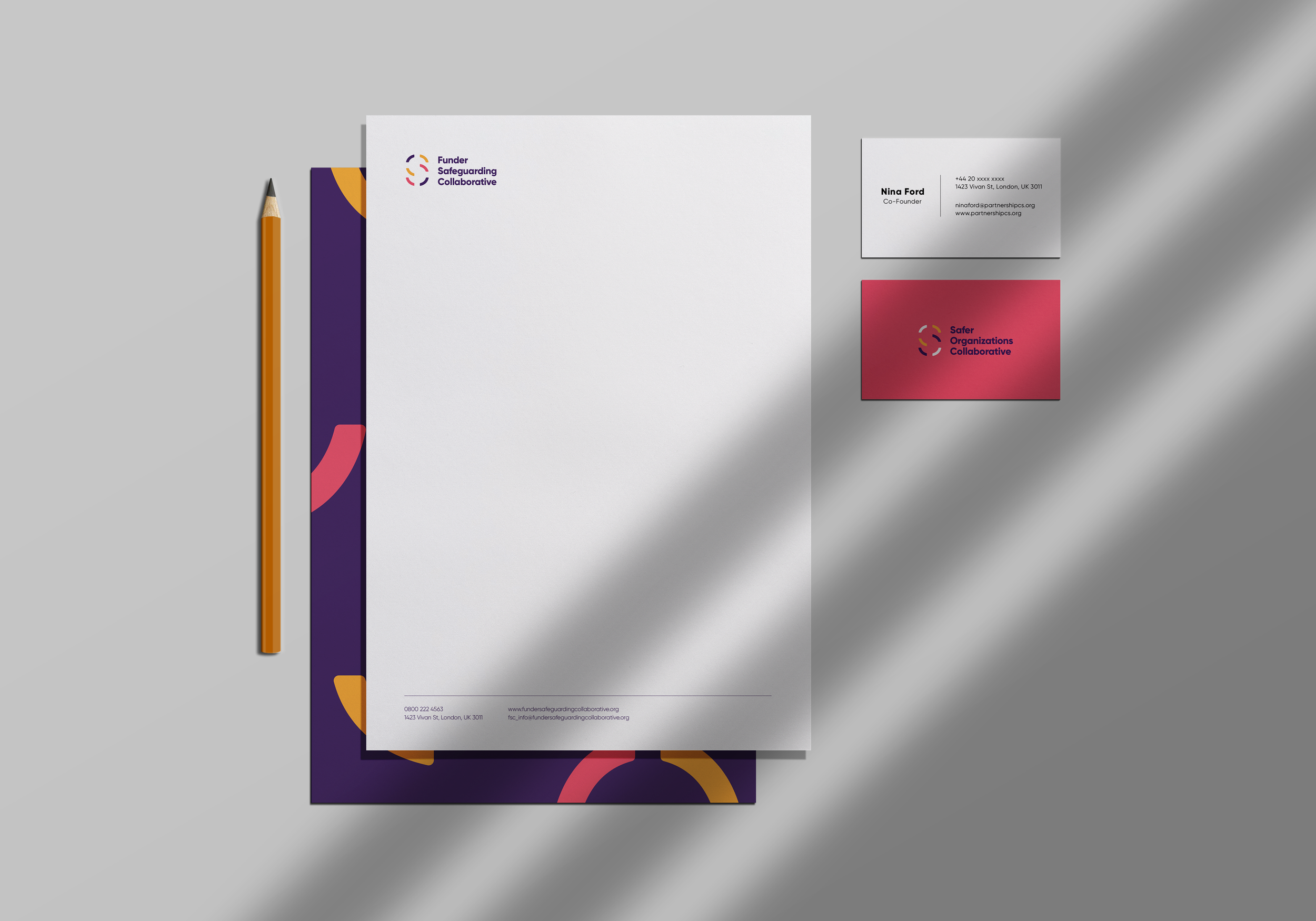
A five-colour palette led by deep purple, with pink, orange, teal and a warm ivory. Brandon Grotesque for headlines and Gilroy for body copy. The stationery shows an early version under the working name Safer Organisations Collaborative.
In use
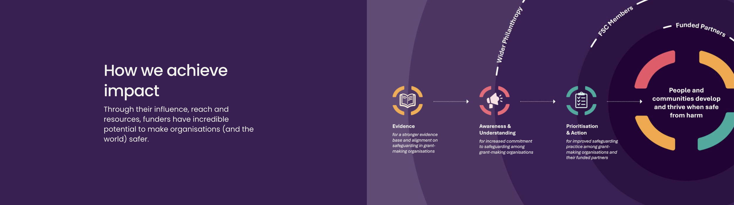
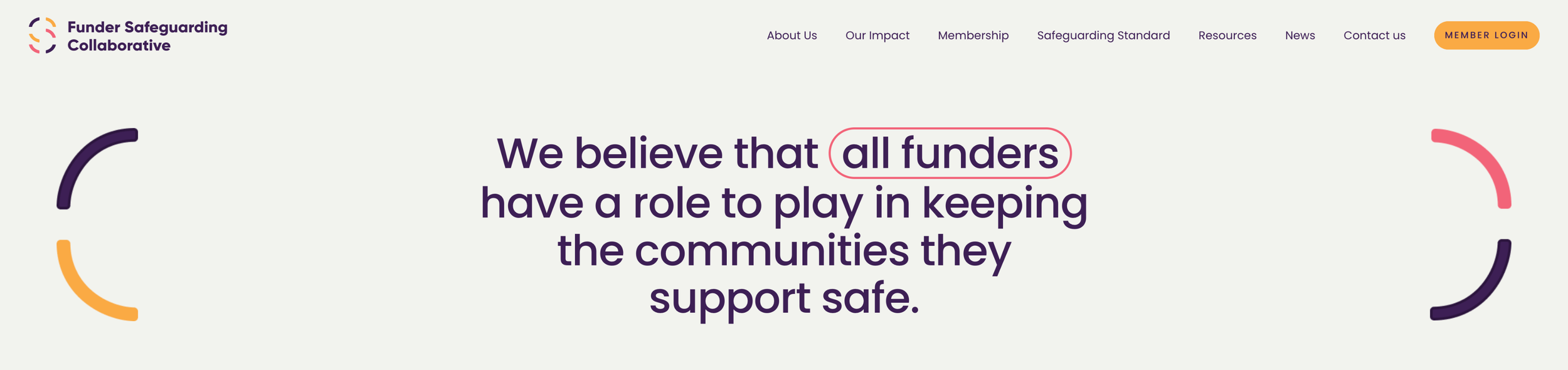
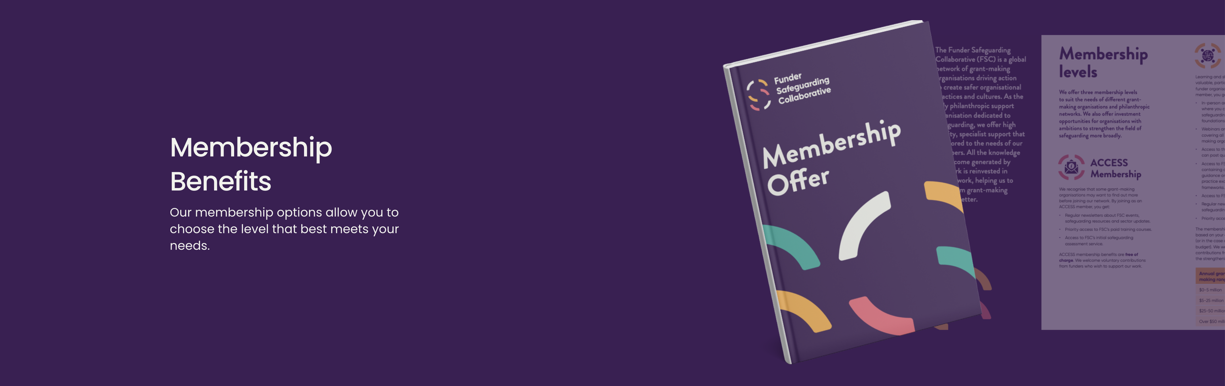
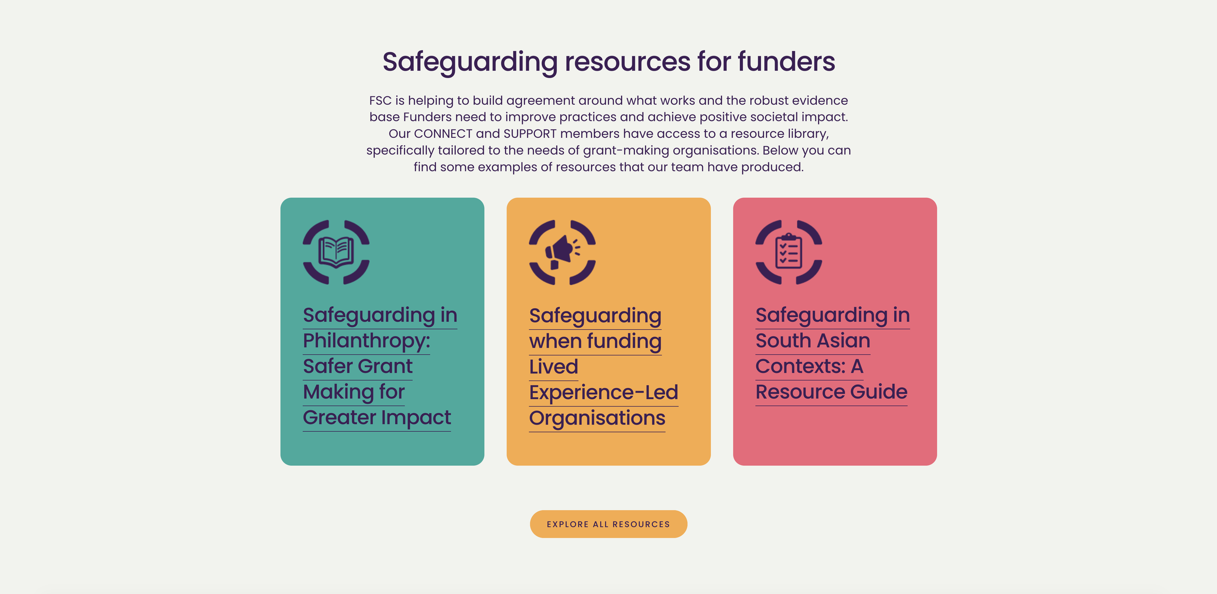
The identity now carries FSC’s website, membership offer, reports and resource icons, where the arcs become frames for icons and photography. Website and applications designed in house by FSC, built on the identity.